Collage is the ultimate remix in the graphical arts. Interestingly, we’re living in the age of remix.
The following is most of the knowledge I acquired since I started doing collages in April 2012. Modern vintage collage is the most popular collage genre these days among younger crowds, so I’ll focus on that.
Regarding paper and digital collages: I prefer the look & feel of paper collages, but I find digital to be more versatile and flexible. For my collages I try to make them look as much as paper as possible. I don’t like adding effects that scream “digital”, because they look lame in my opinion (e.g. transparencies, vector lines, over-cleaned up elements, etc).

“Bay View” by Eugenia Loli
What you need
You will need a modern computer (preferably with a high resolution display), a Wacom Bamboo tablet (~$70 — avoid cheaper models, and there’s no need for more expensive models), and an image manipulation program. The best software is Photoshop for this job. If you use The Gimp or Photoshop Elements 10+, these will do too, but they’re both missing some features. The Gimp is missing adjustment layers and layer effects among others, that we will use a lot, while Elements has almost all the main features in place, but with less flexibility than that of Photoshop. Regardless, even The Gimp can do the job if you cut a few corners and go around its limitations. To follow this tutorial you need some basic experience with Photoshop.
On Photoshop’s user interface, you will need the following tools to be visible: main toolbox (ON by default), main toolbar (ON by default), layers, adjustment layers, and brush settings. The shortcuts I provide are for PCs, so for Mac you will have to improvise a bit (although they’re not that different).
Find your inspiration
First, you need to find some inspiration. Ideas don’t usually come down on artists without some serious influence from other artists. In the beginning, you’ll probably be copying others, and that’s ok. As your personal style pushes through with time and experimentation, originality will ensue. One of the reasons for writing this tutorial is so you can further the art of modern collage. If you stay stuck at copying others, no progress can be made for humanity. But if within some pastiche work there’s also some small innovation here and there, then that’s progress. And that’s the whole point of this.
So, spend a few hours studying these links, featuring collages from some of the best artists in the genre: Cur3es, Mesineto, Ben Giles, Jordan Clark, Jesse Treece, Bryan “GlassPlanet” Olson, Beth Hoeckel, Julien Pacaud, Sarah Eisenlohr, Djuno Tomsni, Cardboardcities, David Delruelle, Dessi Terzieva, Tareco, Caroline Alkire, Owlwise12, and many more. Here are my collages too. 😉

“The Sphinx” by Eugenia Loli
Find your pictures
Your sources for pictures will be old vintage magazines (particularly National Geographic from the ’50s through ’80s), and Creative Commons digital pictures. You can either scan images yourself from these old magazines, or search on FlickR or TumblR, or other sites that have digitally scanned old pictures (FlickR has many groups with old vintage scans, here’s my collection). There’s also some nice Public Domain pics here.
To find pictures you like in the Creative Commons domain, you can use these links to search on FlickR:
– Creative Commons “Attribution” images (BY): you can use commercially (least restrictive — that’s the one I use myself the most). There are 36 million CC-BY images on FlickR.
– Creative Commons Attribution-Share Alike images (BY-SA): you can use commercially, but your collage’s license must have the same license as this.
– Creative Commons Attribution – No commercial (BY-NC): you can’t use commercially, no other restrictions.
– Creative Commons Attribution-Share Alike – No Commercial (BY-SA-NC): You can not use commercially, and your collage’s license must have this license too (most restrictive).
ALL Creative Commons images above require crediting. Don’t forget to credit the name of the photographer and provide their image link on your collage’s FlickR page (when you finally post it).
A tip to select pictures: When it comes to humans, go for vintage imagery. When it comes to landscape or objects, go either way. Modern pictures of humans look really bad (their poses and clothes lack charisma somehow). Also, make sure your pictures are striking and top notch. You can not make a good non-abstract or semi-abstract collage out of uninteresting pictures. This is something I learned the hard way in the beginning.
Make sure your pictures are of some considerable resolution. If for example the picture of the human you’d like to use is only 500 pixels tall, and your digital document is 3000 pixels tall, you have a problem. After you resize it, it will look really pixelated and ugly (not good for printing). Sometimes, you can go around the problem by applying artistic filters on that specific layer (e.g. posterize, watercolor etc), but sometimes you just need higher resolution scans/pics.
Set your canvas
There are standard poster sizes in the US. On your software, create a new image, with the following attributes: RGB gamut, “Adobe sRGB” colorspace, 8 bit, at 180 dpi, with a transparent background. I’d avoid using 32bit color, since it’s too slow, and not much photo-manipulation is happening on collages, so the quality degradation is minimal. Here are the resolutions for standard poster sizes, set at 180dpi, RGB/sRGB:
24″x36″ = 4320×6480 (2:3)
24″x24″ = 4320×4320 (1:1 square)
18″x30″ = 3240×4320 (2:3) (and also, 18″x30″, so it fits on 24″x36″ frames exactly with 3″ border)
18″x18″ = 3240×3240 (1:1 square)
12″x18″ = 2160×3240 (2:3)
12″x12″ = 2160×2160 (1:1 square)
6″x8″ = 1080×1440 (2:3, a small size, if your pictures are small)

For each of these, you can save them with a different preset, so you don’t have to re-enter them on Photoshop each time you start a new collage. The one I’m using usually is the 12″x18″ one, because vintage scans that I find online are usually small in resolution, so they fit that size best.
Cut out your pictures
Inside your web browser, right click on the highest resolution available for the picture you want to use, and select “copy image”. Then, from the Photoshop menu, after you have created the document in one of the sizes mentioned above, select EDIT/PASTE. Your image is now inside Photoshop (PS). Use your tablet pen from now on, and save often.
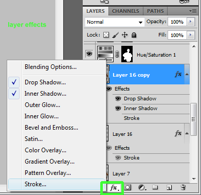
On the layer panel, make sure you have selected the layer you want to cut out. If you have more than one images pasted into the PS document, make the rest invisible (click their little “eye” icons next to their layer). Then, for the layer you’re working on, enable STROKE from the layer effects menu (give it size 2 — default is 8). Layers effects can be reached for each layer from the second icon on the bottom of the layer panel, as shown in the screenshot.

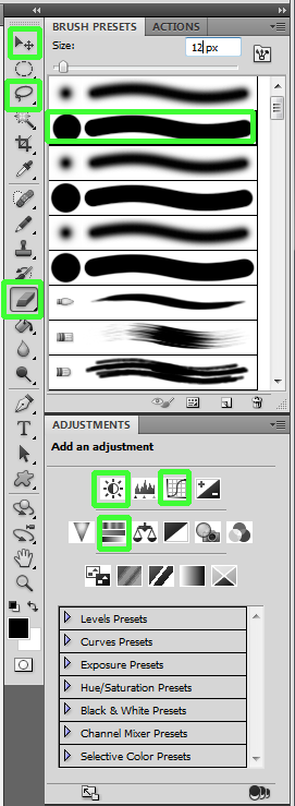
Select the ERASER from the PS toolbox (“E” shortcut on the keyboard), and use the “brush” kind of eraser (from the toolbar). From the Brush properties window on the side, select the second brush kind (the one that’s hard). Set the brush size to 12.
For most of the cutting, use the Polygonal Lasso Tool (this can be activated by long pressing on the Lasso icon and selecting it from the pop-up menu). I find myself using it more and more these days. If you make a mistake with it (e.g. you selected too much to be deleted), undo the last anchor by hitting DEL. Double-click to close down an area to delete by again hitting DEL key on the keyboard.

Some of the most used tools mentioned in this tutorial
Learn the zoom shortcuts: CNTRL+1 for 1:1 zoom, CNTRL+0 to fit on screen, CNTRL++ to zoom in more, or CNTRL+- to zoom out. Zoom-in more than 1:1, and using the Eraser, precisely cutout the image. For the parts that you need more precision (e.g. an angle), change the brush size. Depending on which part of the image you work on, you will have to change brush sizes all the time. The stroke will help you see easier which parts needed cutting. If you make a mistake (e.g. you cut out too much), undo the last action by hitting CNTRL+ALT+Z.
When you’re done cutting out the picture, disable the stroke effect, and make the layer invisible. Move on to cut out the next image. Obviously, if you’re using a single background image, it needs no cut-out, since it’s going to take over the whole document.
Note: there are many ways to cut out objects in Photoshop. Some of these techniques (e.g. using masks) are much more precise than doing the cutting by hand, but since we’re trying to emulate paper cuts, these imprecisions can work in our favor stylistically.
Juxtapose
Create duplicates of all the “cleaned up” layers (you can do that by dragging and dropping each layer in the “Create new layer” icon in the layer panel, or from the right-click layer menu for each layer). Make the duplicates visible, and the originals invisible (so they don’t get in the way).
Download my guides, and import either the square one or the 3:2 one (depending what your document size is) as new layer (on top of all others). If it doesn’t fit perfectly in your document, resize it. Visual guides help you place objects on the image more precisely, in a way that the viewer’s brain can decode subconsciously. They help you apply some invisible visual order.
Now, play around with the images, to compose your collage. You can move an element above or below another element by dragging their respective layer up or down on the layer menu.
Clicking the little “move” icon (first icon in the PS main toolbox) will let you move the images around in the document.
Most of the time, you will need to change the size of some, or all of your images. CNTRL+T will open the transform action for the working layer. Press the SHIFT key while resizing your image from the side anchors, because you want to keep the right aspect ratio (otherwise you will end up with thin or fat heads of people). For pictures of landscape, you don’t have to keep the right aspect ration, it’s whatever works. From the same resize action, you can also rotate your pictures. There’s a little icon on the top toolbar to apply or cancel the resizing, and CNTRL+ALT+Z to undo.
Sometimes you might want to also rotate an image horizontally, or even vertically for more drama. This can be done from the EDIT/TRANSFORM main menu.
Very important: DO NOT resize an image, and then resize it again. Each time you apply a different resizing session, you lose massive quality. If you found that your resizing wasn’t perfect the first time, either undo it and redo it, or duplicate a new layer from the original layer, and then redo the resizing. You can delete unwanted layers by selecting them and pressing the DEL key.
Sometimes you might need to tangle two images together, for example, parts of one image to be visible over the other, and other parts of the other picture to be on top of the other. To do that, set the transparency on the top image layer of the two to 50%, and “cut out” these parts using the eraser tool. Then, set transparency back to 100%.
NOTE: It’s impossible to know which pictures will go well before hand. The way I try many, many pictures until I find something that works, is to only cut them down grossly using the lasso tool, and resize them all the time. When I have the pictures that are surely going to be used in the collage, only then I go to precisely cut their originals (I delete the test layers).
NOTE 2: Don’t “load” your collages with countless objects. Keep them simple. Just because you have this nice picture of a vintage car, doesn’t mean you have to use it. If it doesn’t help the overall aesthetics and vision of the work, don’t use it. Less is more.
Fix the Colors
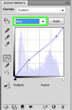
CNTRL+click on the layer’s little representative icon in the layer panel will SELECT the layer’s object in the document. Make sure your object and only that object is selected. Then, from the Adjustment Layer panel, click Curves. Then, click AUTO in the Curves panel. Select the BLUE curve from the drop-down menu there, and make it less blue (usually, Photoshop over-blues images in Auto mode).
CNTRL+click on the layer’s little representative icon in the layer panel will SELECT the layer’s object in the document. Make sure your object and only that object is selected. Then, from the Adjustment Layer panel, click the Brightness and Contrast icon. Play around with these until your layer looks good. Don’t overdo it with contrast, paper collages are low contrast (because film/paper was low contrast traditionally).

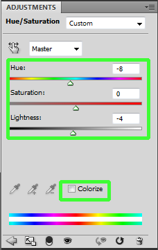
CNTRL+click the layer again to reselect it, and this time click the Hue/Saturation from the Adjustment Layer panel. There, you can play with the hue and saturation (usually, you’d need to reduce saturation, especially for modern, digital pictures). You can also turn images to black & white, or you can play around by pressing the Colorize to give a monochromatic hue to your object (I personally favor the 192 for hue, 8 for saturation in that mode).
Do the same for the rest of the layers.
Apply effects
From the same menu you had enabled stroking in the beginning, enable drop shadow and inner shadow. Change the drop shadow settings (distance, spread, size) to 0,0,8 and inner shadow to 0,0,2, although different designs might require different settings. Tinker with these settings until you get the images look good to your eyes. Don’t go for huge fluffy back shadows, because that’s a tell-tale sign of too much photoshoping. Paper collages have no shadow, we simply try to emulate the 3D-ness of glued paper. Do this for each image layer separately (except for adjustment layers).
Now, zoom in and look at the state of your resized objects. If some of them look pixelated or not clear-enough, select their correspondent layer, and from the main PS menu, select filters. I usually use cutout, posterize, watercolor, and from the last filter folder, the Craquelure. Sometimes, I stack up to 3 filters together (there’s a stacking area in the filter window).
Your objects will look different among them (since different filters were maybe used on them, or some objects might be in black and white), but that’s a style choice. You can also purchase third party artistic filters to get more “looks”.
Curves
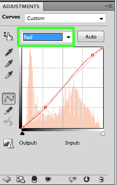
This is the final collaging step. Just click the topmost layer in the layer panel, and then from the Adjustment Layers panel (you might have to hit the “back” icon in that window in order to go to the adjustments listing), click the Curves layer. A new layer will be created in your Layers panel, on top of all others, and with a mask that covers the entire document. Make it look like this for a vintage look (you can play around of course):


If you’re using Adobe Photoshop Elements instead, download and install this Curves plugin, because the Curves that come with Elements is a joke. The only two differences with the full Photoshop Curves is that this can only be applied on per-layer basis, instead of the entire document. So you will have to do the same Curves adjustment for each layer separately. Also, this plugin is working as a filter, and not as an “adjustment layer”, so your changes are “baked” into the layer for good. That’s why make sure you apply these changes in copies of your layers (so you have your originals intact in case you don’t like the changes after a while).
BUSINESS SIDE
EXIF Info
At FILE / File Info, enter the title, artist name, if any Creative Commons credits in the description (photographer name and FlickR URL), copyright-it, enter the name of the license (prefer the Creative Commons “Attribution-NonCommercial” license), and the URL to your main page. Say “ok” there, and save the document.
It’s important to include EXIF info on your jpegs because if people make a post using your art but never include your name or blog in the description, this can theoretically still be retrieved through the EXIF info.
Export
You will need to export 6 different images, apart from the original PSD document.
1. Save as JPEG, quality 10, Baseline OPTIMIZED. That’s the main exported image, for Society6 (or for FlickR, if you’re not selling your work). I save my collages using their title as their filename, for example for my “Bay View” collage, I save it as bay-view.psd and bay-view.jpg. But for the purposes of this tutorial, lets call it collage.jpg
2. Load the just-saved JPEG as a separate document, and from the IMAGE main menu, select IMAGE SIZE. Type 1024 for height, the width should automatically change. If your document was square or wide, type 1024 for width. “Save As” using your collage’s title plus the -web suffix, for example: collage-web.jpg (save using quality 10, Baseline Optimized). This image is for TumblR. CargoCollective, Facebook, etc. It’s basically the “advertisement” version of your collage, at lower (but high-enough) resolution that you will use for all web sites (except for society6, where you export the full sized version from #1).
If you’re selling on Society6, there are a few more exports to do:
3. Create a new, empty document at 4600×3000 pixels (save it as preset the first time). On your collage document, select SELECT ALL from the main select menu, and then “COPY MERGED” from the EDIT menu. Then go to the new document, and PASTE it. If your document is a 3:2 one, from the EDIT/TRANSFORM menu, select “ROTATE 90 CW” and resize it to fit the document. Hold SHIFT when resizing in order to keep the right aspect ratio (you don’t want to squash or stretch the picture unnaturally). Apply the resizing and save this document as collage-laptop.jpg This is for Society6’s iPad/laptop skins (I prefer to export for iPad vertically, instead for horizontal laptops, since I believe that more people are buying iPad skins than for laptops).
4. Create a new, empty document at 1300×2000 pixels (save it as preset the first time). On your collage document, select SELECT ALL from the main select menu, and then “COPY MERGED” from the EDIT menu. Then go to the new document, and PASTE it. From the EDIT/TRANSFORM menu, resize it to fit the document. Hold SHIFT when resizing in order to keep the right aspect ratio (you don’t want to squash or stretch the picture unnaturally). Apply the resizing, and save this document as collage-iphone.jpg
5. Create a new, empty document at 3300×5100 pixels (save it as preset the first time). On your collage document, select SELECT ALL from the main select menu, and then “COPY MERGED” from the EDIT menu. Then go to the new document, and PASTE it. Move the pasted image near the top of the document, and then select ALL from the main select menu, and then from the layer main menu select ALIGN LAYERS TO SELECTION / HORIZONTAL CENTERS. Do not resize up, no one wants a huge image of your collage on their t-shirt (if anything, maybe resize down, by keeping the right aspect ratio by pressing SHIFT when resizing). Save this document as collage-tshirt.png (note: save this as PNG, not JPEG). Sometimes, I remove the background completely for t-shirts, since depending on the design, it can look better that way.
6. Export at 3500×3500 (square) for pillows & tote bags (make sure you don’t change the aspect ratio though, I usually crop).
7. There are a few other new products to export as. Especially the Print All Over shirts that look great with collages. You will need to be creative to make a collage fit right on a t-shirt (e.g. you might need to reverse and duplicate parts of the collage to fit it right in the sleeves etc).
Society6 (optional)
After you have setup your account at Society6, to post a collage there, select “post/sell” and click the checkbox. Enter the title, upload the full quality collage.jpg file, select 3-4 categories, and enter the pricing at the bottom (if you don’t enter the pricing, you will make $0 for each item sold). In the next screen, upload the laptop, iphone, and t-shirt files. That’s it, your item is now live and ready to be sold.
Society6 has a two-tier store, your personal store, where everything becomes available for sale immediately, and the Society6 main store, where your work becomes available for sale only after it gets enough “promotes” from other artists. The number of promotes required is not set (they have a secret algorithm to determine this), it can be as low as 10, and as high as 25 promotes.
To get promotes on Society6, you need followers. You get followers by promoting or following the artists you like. Some artists there never promote anything, some do. Some artists only promote things they actually like, but you shouldn’t be like that if you want to acquire followers. You should also be promoting artists that you have noticed that they promote a lot in general. Society6 should not be seen as your “likes” repository, it’s business. As such, your promotes must be strategically placed. It’s your job to spend a bit of time each week on Society6 to enlarge your circle of contacts there and hopefully acquire promotes. Don’t overdo it with promotes though, you don’t want to end up with many thousands of promotes. Maybe 100-120 promotes a week are a good number to go by.
Finally, don’t upload more than one collage per day on Society6, because then they will be fighting for promoting votes. You want to maximize their chances for more votes, to maybe even make the front page one day! Remember, items reach the front page in their first 24 hours. Past that time, it’s useless to have people keep promoting your old artworks, won’t change a thing.
Make sure you have an ABOUT page on Society6, that’s where you put the rest of your links, and an email address (so you can get commissions).
Printing
Having said all that about Society6, much more money comes from selling prints yourself, since Society6 takes a huge cut out of the profit. There are a few rules if you’re also going the printing route:
– Your printer technology must be pigment-based. If it’s not, then prints will fadeout within a year’s time on *matte* paper, and you will have a customer problem on your hands.
– You must print on matte, art-quality paper. Glossy paper is useless for high art, it’s only used for photography. Glossy doesn’t fade out, but since you need matte, you must go for the right printer.
– You should get a printer that supports rolls if possible (cheaper, better types of paper available, convenient).
– Always select the right paper on the printer’s configuration dialog that opens up via Photoshop, otherwise the colors can go all crazy when printed.
– For Canon printers, I had to configure the brightness to +10 and contrast to -10 to get the image right. I didn’t have to do that on HP printers. Not sure about Epson printers.
So, there are two ways to go about printing:
1. Buying an 18″ or 24″ photo Canon or Epson printer. These printers start at $2000 as of this writing (2013). They’re good, but expensive. Unfortunately, as of this writing, HP doesn’t have pigment printers, they’re behind the curve regarding this technology.
2. Buying a 13″ printer (which is good for 13″x19″ sheet prints with 1″ or 2″ border). There are 1-2 Epson models ($170) and 1 Canon ($150) that are both at that size AND they feature pigmented ink (so the prints won’t go bad for 200 years).
After you print, you sign it on the low left corner. Then, you put tissue paper on it to protect it, you roll both, and then you ship it using mailing tubes. Always buy 2″ more of mailing tubes length than what your print is (e.g. for a 13″x18″ print you’d need a ~15″ tube), and you go for 3″ width. 2″ width is too small to roll more than 1 print in it. I use Paypal to automatically do US postage, and I print a customs form from the USPS web site for international ones. The domestic Paypal rolls are ready for drop-off (they’re paid), but the international rolls must be paid on the USPS counter (however, it’s super fast, since the customs info is already printed and attached to the roll).
For smaller collages (e.g. 6″x8″), I send them out using plain “Do Not Bend” hard envelopes, paid via Paypal (both domestic and international — Paypal can’t do international rolls only).
Check my own shop page to see how I have structured that page to direct customers both to Society6 and on my own printing business.
Making Money
Every time Society6 has a promotion (e.g. free shipping, or free shipping using a special URL code) you must make a TumblR or Facebook post (depending where you have more followers at). Sometimes, you take screenshots of your various products on Society6 to show to your followers how your art looks like when it’s printed on various products. Without frequent such posts (once a week or so), people don’t bother buying.
A few things I’ve noticed:
– People mostly buy art on weekends, when they have time. Especially on Sundays. In that case, it’s best to do such a promotional blog post on Fridays and then leave the post up until Sunday. DELETE these posts after these promotions have expired, don’t let them clutter your Tumblr or Facebook page.
– I sell 40% of prints on Society6, 40% iPhone cases, and 20% of everything else (e.g. tshirts, tote bags etc), so make sure you export for most products, as mentioned above. Some people don’t want to export for iPhone cases and such out of purist’s ideology, however, there is something to be said about modern times: these days, the young people are showing off their art on their iPhone case, not on their wall. Older, or established people usually buy prints to frame and put on their walls, but young people mostly buy tshirts and iOS cases. This doesn’t mean that you are cheapening your art by putting it on an iPhone case. You simply go with the times, and times have changed. People see and utilize art differently today than they did in the time of Picasso. Embrace change, don’t stay behind. If you want to express your unhappiness about the uber-commercialization of art these days, simply make a collage about it! But don’t restrict younger viewers from enjoying your art the only way they know how!
Instagram
That’s where you can get the most attention for art these days (in the 2000s it was Flickr, in 2010-2013 it was Tumblr, now it’s Instagram). Use up to 25 tags ONLY.
TumblR
TumblR is not optional. It’s the heartbeat of contemporary art. That’s how you become known these days, there’s no “Rolling Stone” equivalent magazine to shoot you big. The public decides instead. If you already have a TumblR account, create a new blog for your collages, you want to keep it separate from everything else. Make sure you have links to your FlickR, CargoCollective, Facebook, Twitter/Instagram (optional), and Society6 pages, along with a way to contact you. You don’t want to have gallery professionals or magazine artist directors not being able to find you! Give out an email address, don’t be shy!
Create a new “photo” post, “set a click-through link” to your tumblr page, and upload the collage-web.jpg file. For caption enter the collage’s title (linking to your Society6 or FlickR page of that artwork), and your name (linking to your tumblr page again). Here’s an example on how a post of mine looks like. On TumblR is important on acquiring followers, so this posting method, maximizes that.
Under the title/name, include your information, on every single post (I usually copy/paste it from a previous post). Here’s how my HTML “signature” looks like:
<small><a href=”http://cargocollective.com/eugenialoli”>Gallery</a> | <a href=”http://eugenialoli.tumblr.com/shop”>Shop</a> | <a href=”http://eugenialoli.tumblr.com/”>Tumblr</a> | <a href=”http://www.flickr.com/photos/eugenia_loli/”>Flickr</a> | <a href=”https://www.facebook.com/EugeniasCollages”>Facebook</a></small>
Change the URLs to your links, leave the rest the same. Watch out for HTML bugs!
Then, on the tags box on the right sidebar, enter the following three tags (comma separated):
collage, art, artists on tumblr
TumblR only takes into account FIVE tags, so don’t enter more than five. The first three tags are important, because they’re mostly curated. If your collage is selected, then your work will be shown to thousands of artistic-minded people. These tags are also browsed by TumblR Staff, who run the TumblR Radar, which is a daily image selection shown to ALL tumblr users. If you ever get on TumblR Radar, you can achieve a million views and get thousands of followers in a single day! But your way to the Tumblr Radar usually goes through the curated tags, so get these right!
The fourth & fifth tags can be related to your collage. For example, if your collage has pyramids in it, enter the the words: pyramid, Egypt Then, create the post.
FlickR
There are two reasons why FlickR is important:
1. Through its various Groups, you get exposure to not only new fans, but also magazines and galleries. Galleries are still using FlickR instead of the more modern Tumblr.
2. Through the “share” function, people can share to their Tumblr (the main goal is always Tumblr).
Upload collage-web.jpg on FlickR (or the main collage.jpg image, if you’re not selling anywhere). Don’t forget to type in the credits (if any), if you haven’t already entered these in the EXIF DATA as mentioned above.
For tags, comma separated, enter:
collage, art, “your name” [in double quotes], [and one more tag word that describes your collage]
TumblR bloggers are using FlickR’s automatic tumblr blog-posting abilities, so these tags will automatically get carried over. By entering your name on FlickR as a tag, you can then track that tag on TumblR. This way you will know, 80% of the times, if someone has blogged your work or not (few bloggers delete these tags).
I’d suggest you offer your work under the Creative Commons Attribution-NonCommercial license, and not the default “all rights reserved” one. Let blogs be allowed to post your work without permission, it’s no commercial usage anyway! Join the cultural revolution. Heck, this very document exists for you exactly because this mindset drives me to write it. Give something back too! You’re not losing your copyright, you only allow non-commercial usage of it (e.g. posting on blogs, a school or non-profit using your image etc). And since it’s also “Attribution”, the people who will use your image, must also include your name and a link to your original work. So basically, if you play your cards right, Creative Commons can be free advertisement for you, rather than a burden.
Finally, subscribe to the 30 biggest collage Groups on FlickR, and post your work there too (to find them, check the ones I have posted my collages into, and follow them). Many TumblR bloggers are browsing these FlickR groups, trying to find new, original artwork to post.
Update your profile on FlickR with info, and include the rest of your links. Always be easy to find and be contacted. DO NOT include links for Society6 or your personal shop on Flickr, it’s against their rules.
Facebook, Twitter, CargoCollective
If you have Twitter, do a tweet about your new collage, with a link to its FlickR or Tumblr page. Don’t upload images on Twitter, just link instead. Your goal would be to have the biggest fanbase primarily on Tumblr, since that’s where the young people are (ages 18-35), which are usually the ones who appreciate mostly that type of art.
After you have acquired a bit of a fanbase, create a Facebook fan page, and invite your TumblR friends in it. On Facebook, you can upload the collage-web.jpg file. Include a link to your shop or society6 page for each collage posted. Also, subscribe to a few collage groups there, like Not A Paper and Collage of the World and upload there too.
Eventually, get yourself a CargoCollective account (it’s invitation-only, but you can ask for an invitation). There, upload your collage-web.jpg versions of your files, but *only* the ones you really like. That’s your gallery page, you see, many professionals use it, so make sure that only your best stuff are there. Make sure you have an ABOUT page with info about you, links, email address, and a link to your shop. The free version of Cargocollective allows up to 12 projects and 120 MBs of data to be uploaded. 12 projects is enough for most, but 120 MB of data is tight, so you might want to export at 750 pixels height (instead of 1024px) which will generate a smaller file size.
Pinterest, WeHeartIt
I also use these two services. Pinterest connects me to an older fanbase, while WeHeartIt gets reblogged a lot on Tumblr. I always use the collage, art, my-name, and two more tags on WeHeartIt, so when some of these are getting reblogged, they’re carried over to Tumblr.
So, for WeHeartIt, I share it via Tumblr’s individual collage page (after I have installed its browser extension). And for Pinterest, I share either via my Flickr’s “share” function, or via Pinterest’s own browser extension, again, on the collage’s individual Tumblr page.
Regarding Behance, I don’t use it, although I might do so in the future.
Overall, uploading for all these sites that way every time you release a new collage should take you an additional half an hour, maximum.
Conclusion
Please email me if you have questions, or if something is not clear in this text. Also, I’d love to see what you’re done with my instructions, so please send me your FlickR links! Good luck!


