Author Archive

The Best 2010 Bay Area albums

For yet one more year, Brooklyn keeps the reigns as the place with the most innovative new music. Interestingly, they have kept these reigns longer than Seattle did in the early ’90s with grunge. San Francisco has always produced some big names in the industry, but it’s not something that happens frequently, and most of these names are definitely not at the same par as LA or NY. Nevertheless, some true gems do sprung from time to time, but unfortunately except 1-2 of these bands, the rest are relatively unknown. For 2010, these are my favorite Bay Area bands and albums.

Note: For better audio quality on the Youtube videos below, please change quality from 240p to 360p after the video has started playing.

1. Soft MoonThe Soft Moon
Sub-genre: Neo-Goth rock. Sounds like: An umbrella of ’80s goth bands, plus originality.

Read the rest of this entry »

What separates TV series from movies

Note: This blog post is about the *look*, not other aspects of filmmaking.

Why most TV series often look so cheap, so not-cinematic, even if they use the same cameras and gear? The 3rd season of Dexter for example looks terrible compared to its first two seasons (they switched from film to digital at that season too, but that wasn’t the real problem). Hawaii 5-0’s interior shots leave a lot to be desired too. SGU and most of SyFy’s shows (shot in Canada’s cheaper studios) look bad too. CSI:Miami is one of the few shows that looks good (too bad everything else sucks on this show).

I thought long and hard, and after some deliberation, my opinion is that the main offense of TV series is bad lighting. It seems that DPs working for TV shows don’t have the time, or the right experience, or don’t have the budget available to them, to use the right kind of lighting gear. On Dexter for example, they often use no lighting or reflectors outdoors, and so the cameras have to open up in order to not get blacked-out faces. This results in a completely over-exposed background, and often the faces are still not well-lit. It just looks ugly. Even my husband noticed, while he never watched seasons 1-2 for comparison.

The second offense is on-the-go color grading. Not much work is done to make it look cinematic (meaning: low saturation, low contrast). If anything, TV colorists bump up the saturation/contrast like there’s no tomorrow as in a “look at me, look at me” contest (as if TV sets’ over-the-top default color modes were not enough). They think that if they make it so harsh to look at, somehow the story will get under the skin of the viewer. Well, I find it to have the exact opposite effect.

But anyway, bad or non-existent lighting remains the main problem. With few to non-existent wide shots being the third offense. And cheap color grading sitting in the middle.

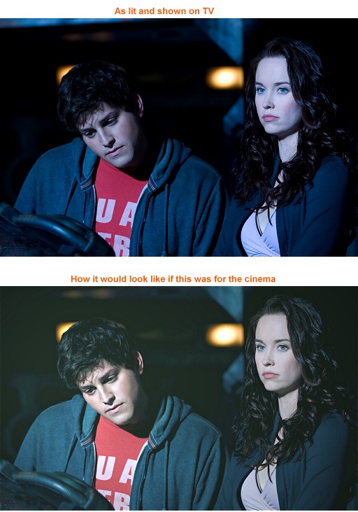
Here’s a screengrab from Stargate:Universe (SGU), showing the problem. A completely blacked out image, and I’m having trouble viewing what’s going on in the scene, even when my TV is on “movie mode”, the kindest of the color modes. We get it. SGU is supposed to be a “dark” TV series, but the visual darkness of it has to be realized strategically, not by blacking everything out to the point of having to wear night vision goggles, just to make out what the hell is going on at the screen.

I had to lower contrast, gamma, saturation, increase brightness, change the hi-mid-low colors, add a bit of unsharpen mask, and most importantly, I had to re-light the scene using a spotlight plugin (obviously not as good as real lights). There should not be any hard shadows on the faces of the actors, unless it helps with the story (e.g. having half of the face in shadow, if the hero faces a dilemma).

Here is another terribly-lit shot. And one more. SGU is full of such shots. While they try to convey the dark, power-struggling spaceship, they take a lot away from connecting with the story and characters. It could be done better, and still convey what they needed to convey.

I hope that younger DPs would be able to provide the cinematic experience using TV’s fewer resources, by being smart.

The Soft Moon

“The Soft Moon” album by Bay Area musician Soft Moon (aka Luis Vasquez), released yesterday, has been a revelation to me. It’s currently on my top-3 albums of the year, along Broken Bells and Wild Nothing. It has a dark goth/industrial sound, perfect for those who prefer awake nightmares.

My case against Acer’s new Android smartphone

Acer just announced a new smartphone, with a large 4.8″ screen, and a 2 MP front webcam. I have a beef with the phone’s resolution and aspect ratio though: it’s 21:9, 1024×480. What pisses me off even more is that Acer actually claims that this is a resolution optimized for movies. Well, guess what, it’s not a practical solution for video. Ideally, this phone should have had a 1280×720 resolution instead. As a videographer, movie buff, and an ex-programmer, let me explain.

Users will have to rip or pirate content to properly utilize the resolution of that Acer phone. Even if Acer comes pre-installed with Netflix or Blockbuster, these services don’t encode their material in 1024 pixels wide. Meaning that, to get an exact 21:9 aspect ratio, at a 1:1 sized movie, you will have to rip it yourself, or pirate it. There’s no way around it.

So, when you rip a BD, you will get 1920 px horizontally. The vertical size doesn’t matter, because it’s never the same for movies. Movie editors just cut as much of the vertical resolution as they see fit. Some movies are really cut with a “thin” aspect ratio, and some are at full 1080px vertically. You never know what you’re gonna get, since there’s no hard standard, and so the only number that matters in this argument is the horizontal resolution.

So, for Acer’s 1024px horizontal resolution, its ratio to the “master” 1920 is 0.533333. For 1280px, it’s 0.666666. 720p’s 0.66 ratio is WAY better for faster computation (because it’s a cleaner number to 0.53), and because it’s exactly 2/3s to 100. Faster computation, and “cleaner” number means fewer resources, and cleaner PICTURE. When you resize down your movie to fit the 720p resolution from 1080p, the pixels will align better than on a random ratio that 0.53 is.

But there’s more. Movies aren’t all what people watch on their phone. They also watch 720p HD clips that themselves recorded, or TV shows, which are shot/edited at exactly 16:9, and not 21:9. This means, that all that content is going to get played back with vertical blackbars (which you would agree, they’re a bigger offence than horizontal blackbars). And if they don’t get blackbars, it means that they get resized on-the-fly to fit the screen, essentially making everyone on these videos look fat and unnatural. Surely not how you want to watch your videos.

Not to mention the HD webcam of the phone, which would have also to get blackbar’ed (or worse, stretched) to fit this odd screen resolution!

The right decision for Acer would have been to use a proper 1280×720 screen. It’s possible that our current electronics are not fast-enough yet to drive such a pixel resolution (1280×720=921600px instead of 1024×480=491520px — 720p requires ALMOST DOUBLE the graphics processing power). But honestly, I don’t care. If they didn’t have the processing power to do the right thing, they should have stayed with either 848×480, or 960×540, the other two 16:9 resolutions that also make some sense. But 1024×480, should burn and die.

Can’t wait for M83’s new album

One of my favorite albums of all time is M83‘s “Before the Dawn Heals Us” (2005). When they released their 2008 album “Saturdays = Youth” it was a disappointment for me. Not because the album wasn’t good (it was), but it was not the same genre as their 2005 album. It was indie rock, instead of cinematic, operatic, space shoegaze, epic, electro-classical music. The problem was that no one else was writing such music, or as well. It was like seeing a metal worker, one of the last ones creating Samurai swords by hand, to leave his job, and go work for a factory. Just didn’t sit well with me.

Today Pitchfork interviewed M83, and to my enjoyment, they said that their new album will be even more epic than all their others, and that they are coming back to the old genre:

“[…] This album’s going to be very long with some spoken word interludes– very dreamy, powerful, intense. It’s more like I’m trying to make the soundtrack to an imaginary movie.”


Unofficial video by a fellow Greek, for M83’s * track. Change quality to 480p after starting the video.

Can’t wait!

Vimeo should create a TV channel

I bought the Roku XD|S a month ago (my review of it), and the only service I mostly watch on it, is Vimeo. I watch it even more than Netflix, Amazon on Demand, and the newly released on Roku, Hulu Plus. And unlike these services, Vimeo is free, and the quality of the clips there is astounding! It’s food for your brain, and for your eyes. Vimeo’s (good) clips are pure art.

I would wholeheartedly and honestly advise every filmmaker, artist, or video enthusiast to buy the cheap version of Roku (Roku HD, $60), just for Vimeo. Do this even if you’re in Europe, and most of the other Roku services are not available there. Just get it for Vimeo alone: the price is right, and most modern PAL TVs can playback NTSC content anyway! The other versions of Roku that do 1080p don’t matter, since the vast majority of the Vimeo videos are in 720p, or lower. As a bonus, you will also get a YouTube channel, just in case you want to watch on TV whatever’s not on Vimeo (meaning, mostly crap).

Quality is great on my 50″ Pioneer plasma TV. Especially when viewing a video originated from a “clean” source footage (e.g. a timelapse that its source were still pictures), or the video was encoded by Vimeo in 1080p (~4 mbps VBR h.264), the quality is way better than Comcast’s, which averages 1080i at 12 mbps mpeg2 CBR!

Sure you can watch Vimeo on TV via your computer’s TV-out (if your PC has HDMI-out in the first place), but it’s not the same experience. You would constantly need to reach your computer to select another video, and Flash’s h.264 playback occasionally stutters even on the fastest PCs, even with hardware acceleration. Roku’s h.264 implementation is smooth as butter and its usability feels like real TV, not some hack that has to share resources with other PC services.
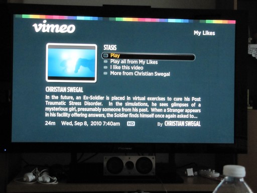

The Vimeo service on the Roku

Going a bit further than that, I would love to see a Vimeo TV channel. Either a traditional TV channel to be given-away via cable/satellite, or a more modern one, via an application for Roku/GoogleTV/etc that can stream “live” video (live meaning, not on-demand). Keep the current Vimeo TV versions that lets you login, “like”, watch your channels/groups etc, but also provide a “live” channel playing the best-of-the-best videos 24/7. The CouchMode can co-exist, but since it runs through a browser, navigation is a bitch and it offers a crappy experience (on GoogleTV, pressing “menu” brings up Chrome’s menu for example, not Vimeo’s).

The reason why I’d like a Vimeo “live” (non-ondemand) channel on top of Roku’s Vimeo channel and CouchMode is because these services only let me watch my own “likes”, and the Staff-Picks/HD Channels only, while I’m more interested in more good content than just that. I want someone else (Vimeo) to go through the best of the best of all time, and show them to me instead of the comparatively small selection that currently exists in the above mentioned lists/channels. Sure I can search for videos myself, but I can’t know if what I’m getting is good or not. Vimeo can do the picking for me. I just want to turn ON the TV, and watch goodness, stuff I possibly never watched before, without me having to search for it. Let me explain. This is how I envision the Vimeo TV channel:

Take any video with over 299 views, longer than 29 secs, and divide its number of “completed” views to its number of Vimeo “likes”. All videos uploaded after 2009 that produce less than “200” as resulted score, can be green-lit to be shown on the live Vimeo TV stream. For pre-2009 videos to get shown, the score must be less than “100”, because people kept “liking” easier in the past. Some of my early videos in 2007 got more “likes” than they deserved, for example. Either that, or people are more difficult to “like” these days — whatever the case, I have observed differences in “like” habits, probably because after the dSLR revolution more good stuff are uploaded today than back then.


Here’s a video that only has 460 views so far, but it has 58 “likes”, creating a score of “8.1” (which is super-high score). There are many hidden gems on Vimeo like this one!

– One 30 second TV commercials after the end of each video shown. Show two commercials if the video that follows is more than 10 minutes long. Don’t show ads on top of videos. Don’t cut off full movies for commercials, unless you can work something out with the copyright owner. TV commercials pay way more than web ads, so that should be Vimeo’s incentive to create a TV channel.

– Show information of the video following in a black screen for about 8-10 seconds, with a title, thumbnail, credits, date uploaded, description, CC license if applicable, HD or not, new or not, etc. It would be nice to also show the median score too, so we known if what’s coming is a masterpiece, or just plain good… 😉

– Using Vimeo’s “Categories“, Vimeo can categorize each video into these categories, so it can have hourly “programs”. For example, you get the documentaries in 6 PM, the short films at 8 PM (primetime), music videos after 11 PM, etc etc. For web TV series, they can even be shown from 9-10 PM, every weekday, for about 5 minutes each (since they don’t usually last more than that). Every weekend there can also be a 3-hour marathon of the best-scored clips of the week. Of course, most uploaders never add their videos on these “Categories” (were you even aware of that Vimeo feature? I wasn’t until recently), so some interns need to get employed and go through sorting these green-lit well-scored videos. From that point on, creating actual “thematic programming,” is a go.

– Vimeo (like YouTube) already has a perpetual license to broadcast videos people upload to it, so I don’t see why they shouldn’t. If you don’t like this arrangement, remove your video from Vimeo. Easy as pie.

– Later, if this whole experiment works, Vimeo can become a studio itself, and produce hour-long scripted shows. Stay away from reality crap though — let that remain YouTube’s sin. Vimeo is about art. Shooting in NY is very expensive though, so this might be something that has to happen elsewhere.

– Finally, this step is important: have two versions of live Vimeo. One that upscales everything to 720p, and one that upscales everything to 1080p. Meaning, don’t change resolution depending on the video shown, just upscale it. The 720p version ensures compatibility with more devices (e.g. the cheap version of Roku, AppleTV via Boxee), and the 1080p version allows TVs that have a native dot-by-dot mode to watch the videos in 1:1 size, without any overscan. See, when a video with a non-1080p resolution changes the TV’s 1080p native resolution, the TV is getting thrown out of its native dot-by-dot mode (better quality), so we need to reach for our remote control and re-set it for every video. This is what happens now on both my Roku and my GoogleTV. And is very annoying.

– For broadcasting/upscaling, every clip that was green-lit for Vimeo TV will need to get re-encoded. Re-encoding the 2 mbps Vimeo video would have a huge impact on quality, so these clips must be re-encoded from source instead, with more bitrate.

Why web TV hasn’t taken off

I spent the day checking out the state of professional web-based scripted shows, and I found that the medium hasn’t taken off. Few people watch scripted shows online, apart the occasional viral YouTube video.

The first thing that comes to mind is that their quality in most of these shows is bad and they feel cheap, but even the better shows, like “Pink”, “condition:human”, and “Trenches”, haven’t been embraced with millions of viewers per episode. Most shows have to settle for about 50,000 views per episode, with only the most popular reaching 300,000 or so. Which is abysmal considering their worldwide availability. So what’s wrong?

First, we have to check out which kinds of videos are popular, and why. A good indication for this is “The Top 10 Webisodes Chart“, by Mashable. The first thing we notice in that list is that ALL of the series there are skits: quick comedies, a’la Saturday Night Live on TV. And given that SNL itself enjoyed a rebirth after the boom of web video (it was close to cancellation before it), we can conclude that people just want a quick laugh on the web. The vast majority are not after involved drama series that require 100% of their brain power to be devoted to them — even if each of these episodes only lasts 4-5 minutes.

When having a video page open on the browser, we usually also have Twitter, Facebook, and Email open on different tabs too. When we watch something that has a narrative, we often jump from one tab to another. Admit it. Even Hulu’s pro content doesn’t always get our full attention. I was watching The Walking Dead the other day on it, and while I liked the show, I must have paused it in the excess of 15 times during its 70 minutes. Something that is not nearly as common when watching it on TV.

There is of course a solution, and this is where things must go in order for web TV to take off: Web TV must go back to TV. The “web” part of “web TV” should only be the fact that the content is streamed via the internet to the TV, and it’s democratized as the web is. And the “TV” part of “web TV” must be that we should be watching that content on our television set — without distractions. Online streaming should of course still be available to help traveling viewers.

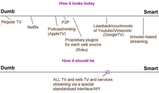
The problem with this idea is that the tools are not ready for it. The market is ready, but the tools available are lagging behind. We are currently living in the dawn of re-inventing the TV, with devices like the Boxee Box, Roku, GoogleTV, AppleTV and 4-5 others too. No dominant device yet. And as this is only the beginning, standards don’t exist. Each manufacturer treats different sources of content differently, and thus creating fragmentation in the user experience.

People don’t really want a super smart TV (a’la PC usage experience). They don’t need PC features, like full web browsing, on their TV. If the ability is there, it’s a plus, but that’s not what they’re after. Instead, they want the OLD experience of dumb TV, but with modern flexibility. For example, users would love to pause streaming on-demand and live TV, get lots of info about a program, comment on it and share it right from their TV’s webcam, co-watch it with a remote friend and talk about the show via the TV when the show is paused, they want to rate a show, they want to check the credits list and get info about actors etc etc. Live stats of popular shows, a’la top-10s of the day or the week, etc etc.

Lots of money can be made for both broadcasters and filmmakers with IP-targeted TV ads too. And for YT/Vimeo video, a licensing shop can be setup, so each time Vimeo makes some money, it can share it with the videographer, and the musician who’s song was used in the video, can automatically take a cut too! Right now, labels are crying over people using their songs on their videos without licensing, and that’s because people don’t wanna pay for that. With an auto-licensing system that gets paid by TV ads based on the number of times it was streamed, the label gets its money, and the user has to pay nothing from his own pocket.

The most important point of all is the COMMON USER INTERFACE. Live TV, recent TV shows, movies, web TV series, Youtube/Vimeo videos, etc etc etc, ALL accessible via a common interface. What we have today is a mess instead: Youtube has its own Leanback mode, Vimeo has its own CouchMode, Podcasts etc. Both are different UIs, requiring from us to re-wire our brains each time we hop from one to another.

AppleTV: Youtube proprietary app (with music videos filtered out), podcast app, renting app, all different UIs. No way for third party video sources to create a “channel”.
GoogleTV: “Channels” are Chrome-based, all different, and when you press “menu” you get a web browser’s menu instead for what you’re watching. All this creates a bruhaha of usability. Switching my brain between Youtube’s and Vimeo’s TV modes, gave me a headache the other day.
Roku: “Channels” can be created via Roku’s API, but they’re all implemented differently because developers have the freedom to screw it up.

On top of all this, all three main solutions today lack content. Netflix and renting or buying, or streaming from free sources, don’t include all the possible content people want. For piracy to end, 99% of all content ever created must be available. So, in conclusion, there are three things that need to happen for web TV and TV in general to get revolutionized:

1. Common UI and API for every source of video. UI coherence.
2. Content is king. More content, with worldwide reach (stop the per-country madness, break down the virtual borders of culture). Either for free, or for a nominal fee, no more than $25 per month (which is much cheaper than cable).
3. Modern features to accompany each “channel”, or video, as described above.

Why I dislike pop music

While I’m not a hipster (unless they’re also scruffy, and wear pajamas most of the time), I definitely listen to hipster music, aka “Pitchfork mandates”.

2 years ago I was a normal middle-aged geek, listening mostly to pop (e.g. Rihanna), and adult alternative rock (e.g. The Killers). Amidst the copyright wars I decided to search online for legal free indie music, in addition to my iTunes purchases. What I found instead was a whole new world of sound. A different way of thinking and appreciating music. I resisted at first, discarding such music as unmelodious and not fun, but I came around, and “got it.”

Then, I started to think about what it is that makes pop hits feel so cheesy, old style, and kits. Formulaic, easily anticipated music constructs was one point, but there was something else too that I couldn’t pinpoint at first. A few days ago I finally realized what was it: it’s the forceful nature of pop singing.

Read the rest of this entry »

The Walking Dead

The TV cable channel AMC recently broadcasted “The Walking Dead”, a TV show about zombies. I personally dislike zombie stories, they’re just not my cup of coffee. However, I can’t say enough about how well-shot and well-scripted this show is. The show is both episodic and serialized, having an almost perfect balance between the two. And being on cable, it doesn’t have to pay respect to FCC’s censorship, something that makes networked shows feel so formulaic and silly. The quality of AMC’s work is such, that I continued watching all its three episodes so far, even if I have a genuine dislike for zombies. Highly recommended.

Papaya with Passion Fruit

We spent 10 beautiful days in Maui, Hawaii, last week. A local gave us a tip regarding how to eat papaya or passion fruit in a way that maximizes the taste of both fruits. See, papaya alone is pretty sweet but bland, while passion fruit alone is somewhat bitter. Combining the two it made for a perfect dessert.

Ingredients (for 2)
* One papaya (must be yellow and a bit soft outside)
* One passion fruit (must be all wrinkly outside)

Execution
1. Cut the papaya in two, lengthwise. Using a spoon, scrape to remove its seeds. Set the seeds aside (do not discard).
2. Cut the passion fruit in two using a teethy knife. Using the spoon, put half of the passion fruit’s seeds in the one half of the papaya, and the other half on the other half of the papaya.
3. Place the papayas in two seperate plates, and enjoy, scraping the papaya with a spoon and eating at the same time some of the passion fruit’s seeds too! Yummy!

4. [Optional] Wash the papaya seeds, place on a baking sheet, and leave out to dry in the sun for a day. You can then use an old pepper grinder to grind papaya seeds on your recipes. Papaya seeds are an excellent replacement for fresh black pepper.