Author Archive

Daily Twitter Update for 2009-09-27

  • One thing interesting about X-Files (1993-2003) while watching the series in episode order: you can see how cellphones got improved over time! #
  • While shooting the music video this morning over the Cliff House in SF, someone called the cops on us. Supposedly we made too much noise… #
  • My "clean" Vista64 PC with just our editing/PS stuff in it is misbehaving. I think it's the graphics driver. I wish we had XP64 in there. #
  • Just came back from a day’s music video shoot in the City for Andy Kong. Went well.
  • Watched Bangkok Dangerous. Not as bad as people say it is.
  • Dollhouse. The worst show on television. That was painful.
  • I am definitely a geek, and not a nerd.

Another weird dream

I had a weird dream this morning (not my first, not my last). I spent the first part of my dream trying to protect a massive octopus, who was apparently a God. He had a book that I kept for him while he was captured by bad humans. There were pictures in it from my genealogy and my village in Greece. I tried not to read its text, but my eye did caught a prophetic verse that was something like this:

10:25 AM to 11:00 AM: Humans are standing up
11:01 AM to 11:04 AM: Humans’ best times
11:05 AM to 11:07 AM: The end of the humans

I felt the need to blog about it, and profess my belief for this octopus God, but at the last moment, my atheist self won out. In fact, my brother could not see him earlier, while I could. I thought that I might be getting crazy, so I gave up to the whole octopus God thing.

I then found myself at my village, between my father’s home and my uncle’s. I was in the middle of the street when I noticed that the sun had become huge, and there was another planet behind it too. It was burning and I could visibly see the fire around it. Suddenly I saw my mother, and I told her to run towards our house to protect ourselves from the solar flares. I tried to find my brother, but there was no time.

Just as we were running towards home, I stopped under a bridge. My mother continued running. I shouted at her to come back, but she continued running. I saw her bursting in flames.

At that point I lost all hope, and I prepared myself for the inevitable. I took some big stones tried to build a quick wall around me, under the bridge. Suddenly, this 40-something guy walks in under the bridge, and unlocks a door that have been there, but couldn’t see before. I followed him in, and there were some stairs, going deep underground.

It became obvious that this was a shelter: there was food, lots of water. Soon, more people arrived. I asked the guy who was he and how did he know about the flares and prepared himself. He said, he was the Octopus God, saving just a few of us. He said that the people that were going to be saved, will instinctively find the door under the bridge.

At this point I started begging him to save my brother. He said that only the chosen ones will be saved. I knew that there was no point arguing about that, so I gave up, and tried to help a few half-burning people that were coming in.

I tried to help a guy lying on the floor, who had been protecting himself with some cloth. I took the cloth away. And it was my brother! He had passed out, but he was not visibly burned. I started shouting at the octopus God to help him!

My heart started pounding fast, and I had trouble breathing seeing my brother lying there not moving. That was when I woke up.

Review: Flashforward

“LOST” is in the end of its life (last season starts this February), so ABC is hard at work trying to find the show that will replace it. Apparently, while “LOST” doesn’t have as many viewers as some other shows, it is very consistent with the 18-49 demographic, which is what brings money in to TV networks. Plus, its DVDs sell very well, despite being one of the most torrented shows in the world, and all its episodes being available for free HD viewing on abc.com and Hulu.

So the show that is set to supposedly replace LOST in the the hearts of us geeks, is “Flashforward“. The first episode aired tonight, puts forward the story for a strong mythology, mysteries, conspiracy and other theories, and of course, personal drama. The first season storyline is building up on the fact that the whole Earth population blacks out for 2:17 mins, and during that time they have a lucid vision of themselves 6 months in the future. The main hero, an FBI agent, tries to put the pieces together.

At this point though, the similarities to LOST are too great to ignore:
– The show starts with a major catastrophe, with the first scene being the main character waking up in this chaotic situation (just like Lost’s Jack woke up in the jungle and ran towards the fallen plane).
– Just like the polar bear on Lost, Flashforward features a kangaroo! A kangaroo out of nowhere running amok in downtown LA.
– Towards the end of the episode, a guy in black, shown to be unaffected by the universal blackout. This guy is the equivalent of the “smoke monster” on Lost, also shown at the end of the Lost pilot episode.
– Two Lost actors have been recruited on Flashforward (Lost’s Penelope and Charlie).
– The show asks philosophical questions about destiny; Lost has dealt with the concept greatly too.
– Heck, there was even a big sign of the Oceanic Airlines in the beginning of the episode, ABC’s way of paying homage to LOST!

Unfortunately, Flashfoward’s pilot doesn’t come close to Lost’s pilot in terms of sets, directing, intensity. It’s a good pilot, but not a masterpiece. The main problem is that apart the main character, the rest of the characters are not as interesting or strongly defined as Lost’s — they feel flat. There’s no Sawyer, there’s no Hurley, there’s no mysterious Locke sitting at the beach not talking to anyone and only smirking away! There are just a bunch of people acting as they would in any other drama. LOST on the other hand, clearly defines its characters from the get go — they feel unique.

Additionally, the main cast seem to be comprised by 14 people, the same amount of actors as in Lost’s first season, however, Lost has a gazillion of supporting actors via flash-backs/forwards/other, enriching the show greatly. Flashforward instead, seems to rely mostly on these 14 characters and very rarely is going to add any more important characters to it. This can make the show feel “smaller” and its plot less significant than the global ramifications it should actually communicate to the viewer. The story should be more epic.

Another thing that bothered me was that the show was not as smart as Lost. For example, when the main character lied to his wife that “he saw nothing else in his vision”, the director/editor shows (again, for a 3rd time in 30 minutes) the part of his vision where he relapses and becomes an alcoholic again. If that was Lost, the viewer would have to figure out what was what in that scene and what was insinuated, rather than having the editor spelling it out for us like we are 5 year old. There were 2-3 more such scenes that Lost would have dealt differently in terms of writing/directing/editing.

Overall though, the first episode definitely made me want to watch more. It is the best new show I’ve watched this fall season so far, and I expect it to stay that way until LOST starts again in February. However, many viewers already complain about how to sustain this plot and keep it interesting: apparently, its writers have said that they have already plotted away 5 seasons for the show. They know where they are going, and most importantly, they have an end date: which is super-important in serialized shows like this (as Lost proved).

I only pray that the show doesn’t become too much of a drama — as was hinted by one of its actors recently — and retains the mythology, action and mystery.

32bit grading & lighting processing

Part of color grading is re-lighting a scene. Unfortunately, Sony Vegas doesn’t have a 3D lighting system like After Effects has, but it’s still possible to hack together some basic re-lighting using Bump Map plugin’s “spotlight” template.

For some weird reason, stacking 3 Bump Map plugins in their own tracks (to emulate a 3-point lighting) is very sensitive to 8-bit processing, and they end up canceling each other out. However, it works lovely, and as it should, when using 32bit processing in Linear mode (mode is available only on Vegas Pro).

Here’s an example of how important grading, lighting, and 32bit processing is.

Original file:


Picture by Melissa Ann Barrett, licensed under the Creative Commons “Attribution/Share-Alike” 2.0 license.

The best I could do with Vegas Platinum’s 8-bit processing while trying to re-light the scene. Project file here (load the .vf file, using the picture here).

Grading and re-lighting with Vegas Pro’s 32-bit linear processing. The result is much more pleasing. Project file here (load the .veg file, using the picture here).

I hope that Vegas will eventually introduce proper lighting functionality, so this way the need for 32bit is minimized. Nevertheless, this article should show you the need for re-lighting while color-grading. Turn on/off the bump map plugins on the project file linked above to see how much re-lighting helps.

Hitting a wall with Vegas

Quite a few Sony Vegas users read this blog, but I might have to move to CS4 or FCS soon. While Vegas is possibly the best *editor* in terms of usability, it doesn’t satisfy me regarding color grading — which is the main thing I do.

Even when using the 32bit mode to grade, I get blotches and ugly artifacts. Using a mask without having too much halo is impossible too. Using motion tracking is not supported. Basic color plugins like a vector-based rainbw-color plugin (like the super-buggy third party Aav6cc) are missing. And if that’s not enough, Red Giant Software has stopped maintaining Magic Bullet for Vegas, does not develop any new products for Vegas, and BorisFX also left the Vegas camp too a few months ago. In other words, Vegas becomes much-unsupported by third party plugins, and itself doesn’t have all the features (or the usability in the current tools) a colorist needs. In my view, Vegas is irrelevant right now, even if it has thousands of users and it gets a lot of new ones every day (who buy it because it’s the best *frame editor* for the price). The problem is with actual support (like on things I wrote here), advanced features, and the nonexistent third party plugin support.

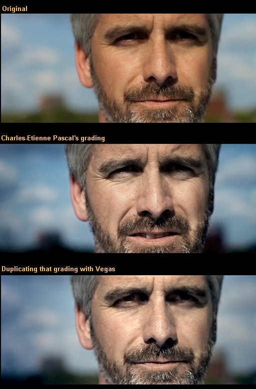
Check this amazing grading done in AE by Charles-Etienne Pascal, where he didn’t use any third party plugins at all (special thanks to Charles-Etienne for letting me use the grabs). The outcome is milky. Doing a similar 32bit grading on Vegas resulted in visible artifacts (when viewed in 1:1). For some reason, Vegas’ own color plugins don’t take a lot of pushing before they show artifacts.

For those interested on how it was done, it involved 3 video tracks, one with a mask around the eyes to lower the gamma in them and make them visible, a track with a mask around the head to change the face color using Color Corrector, change the lighting on the face using bump map’s spotlight option, and some unsharpen mask, and a third track that changes the gamma/colors on the background to make it darker.

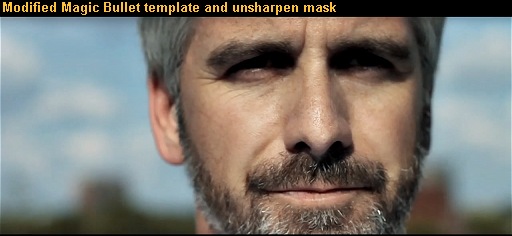
The easiest way to come somewhat close to that look without having to use all these tracks and masking, is by using the “punchy” Magic Bullet Looks template modified, and unsharpen mask.

Nevertheless, Adobe’s CS4 might be in my near future.

Editing Canon 5D/7D footage on Windows

Canon chose a pretty bad format for their consumer digicam and video dSLR products: h.264 in the MOV container, without B-Frames. This creates a kind of format that is very difficult to edit in real time. As I type this, even the fastest desktop PC on Earth can’t decode in real time that footage under Sony Vegas, or even Premiere. As of now, here are your editing options with such footage:

1. Edit as is
It is possible to edit these files as is, by dropping them in the timeline, but you should expect anything between 0.3 and 5 fps. Which means that it’s unbearably slow to do educated guesses on how to cut your project. Additionally, Vegas has very poor support for Quicktime, so after you add a few of these files in the timeline, you should expect crashes.

2. Proxy Files
Proxy files allow you to use small-sized, low-quality copies of the original files that edit faster — and just before you export, you switch to the original files, to export at full quality. Here are tutorials for Vegas Platinum, Pro, and Premiere. The problem with this method is that, at least with Vegas, there’s still a big risk of crashing during exporting (because it would use the original MOV files). Also, exporting is very slow, because the decoding is slow (before it even starts encoding).

3. Cineform
This is the best solution for the problem. You buy Cineform NeoSCENE (or NeoHD), and you drop the files in its utility to transcode them. Cineform is pretty fast decoding h.264, and transcoding the 4:2:0 files to a 4:2:2 format, that’s visually lossless, and easy to edit. The only downsides are that the created filesizes will be double over the original and the gamma will slightly change, but these are a small price to pay for having a stable, and fast format to edit with.

Q&A

Q. Why not use Divide.Frame’s accelerated decoder?
A. Because it’s unstable, and it doesn’t work with all versions of Vegas or Premiere.

Q. What format should I use for proxies?
A. I would suggest you use 640×360 mpeg2 at 1.5 mbps. It’s the easiest format to edit, by far. The Premiere tutorial linked above can be modified to create such proxies rather than its suggested h.264 proxies.

Q. Why not use mpeg2, or XDCam or other high bitrate format instead of Cineform?
A. Because they are not lossless.

Q. Why not use another lossless codec then, like the freeware Huffyuv, Lagarith, Avid DNxHD?
A. Because they are almost as slow to edit as the original files.

Q. How about Matrox’s mpeg2 I-Frame 100 mbps codec?
A. This is a good codec and it works well with Premiere. But it doesn’t work as well with Vegas. More here.
UPDATE: Version 1.0 of the codec fixes the problems!

Q. Which format would have been best to be used by Canon?
A. AVCHD for their consumer digicams, and AVC-Intra for their video dSLRs.

Q. How are the Mac users dealing with the problem?
A. The footage has to be transcoded too, to the intermediate ProRES/AIC codecs before it is able to be edited. There is also Cineform NeoSCENE for the Mac too.

Bigger and better

I just heard Madonna’s new single, “Revolver“. It’s a good song, but it’s not as smart as it could have been. Upon listening to it, I immediately imagined it with a cleaner electronic sound, reduced auto-tune, with traditional Chinese singing/sound at places, and even with some hard guitars at some other spots. In other words, I needed a “bigger” tune that the one released, one that’s more complex musically (one that had many genres combined). Same thing as I like TV shows and films to be like.

And this made me think. What’s with me and “bigger”, “grander”, “more”?

Really, this is a problem. Why the hell I can’t be happy with whatever is being made available to me? Why am I after “more”? Is it because most of the available products/art are indeed “cheap/easy” and mediocre? Or is it because I am thinking too much about the whole thing and don’t let life just flow?

Maybe the answer is in both. Truth is, I am difficult to please. And I just can’t change that. I don’t think I will be finding nirvana any time soon.

Fast & Furious grading

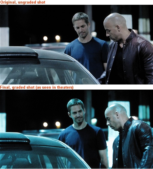
I watched the “Fast & Furious” movie tonight, and it was beautifully graded for the most part (its grading was similar to Transformers 2 with saturated red/yellows and teal everything else). However, there was one scene I didn’t enjoy. I didn’t really gave it much thought while watching it, but when I watched the gag reel and they had the same scene, ungraded, then it really popped up in my mind how much natural and nice the ungraded shot was compared to the final one. What do you think?

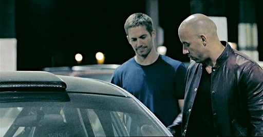
And this is how I would grade it:

Update: Interesting. The colorist of this movie is the one who did Terminator Salvation among others.

Regarding Caster Semenya

I would like to see Semenya to  continue living as a woman and be the gender she prefers to be. But if she went through puberty with a full force of man’s testosterone, then she should not be competing against women.

The elusive “film look”

Many users buy an HD 24p camera these days trying to reproduce the “film look” (aka the “movie look”). They think that if they shoot some random stuff in 24p, and do some color grading, and maybe add a bit of grain, their video will look like a movie.

Fat chance. Wake up and smell the coffee.

There are a number of factors that make a video look like a movie. In my experience and personal opinion, here they are, in order:

1. Framing

If your shots are just some random shots of random stuff, you will never achieve the film look. You need to think hard as to how to frame your subject, what’s in its background, what’s in the surroundings, the rule of thirds. Also you need to expose properly, use the right shutter or aperture values for each scene etc. If you dissect video to its primordial state, it’s just a number of pictures in succession. Therefore, you must operate like a photographer would.

2. Audio

IF your video has speech, then you must capture it right. Capture little ambient noise, clear voices, and use a good music score to complement the rest of the scenes. If your video does not feature people talking, then the music used must fit each scene. You might even have to sync each scene with the track’s beats.

3. Cutting

Do quick cuts when you edit your movie. Don’t waste your time in shots that are useless and don’t progress the story. For example, just an hour ago I watched an HV20 short film where the editor spent 20 whole seconds showing the actor getting out of a car (different shots with the actor moving one hand, then one foot, opening the door, getting one foot out etc). Get to the point, don’t elaborate on useless shots. If you don’t have enough shots to make a meaningful short film then it’s your fault for not storyboarding before you shoot.

4. Lighting

Without good lighting, you are screwed. Audio and lighting are so underrated among videographers. Your light composition must be part of the emotions you want to convey to your viewers. It’s an extra character. Invest in two 500 Watt lights ($100), and a reflector ($100). And if you shoot outdoors, make sure you have the sun on your back! The best times to shoot outdoors and use the available light is either in sunrise or before sundown (“golden light”).

5. Camera Motion

Modern movies have constant movement in most of their scenes. Either with a dolly or a steadycam. Few shots are completely stationary shot from a tripod (usually TV series do that rather than Hollywood movies). The cheapest solutions here are a Glidetrack, or other cheap steadycam solutions. Overall, consider that you will have to pay at least $300 for them. For longer dolly shots, consider this DIY dolly tutorial.

6. 24p

It helps shooting in that frame rate, but in my opinion you can get away with 30p too if you must. As long as you shoot in a 1/60th shutter speed, your motion can get pretty close to movies’ 1/48th. And even if it might not look exactly right, the rest of the video’s quality or story can make up for the lack of real 24p. Basically, what I am saying here is not that 24p is not important, but that it is just 6th in my list. Not 1st.

7. Grading

Colors set the mood of the movie, so grading is important. Just don’t overdo it with contrast and saturation. Film is traditionally low saturation and low contrast, so lay off the god damn saturation/contrast controls! So, modify your camera’s settings to shoot as “flat” an image as possible, so you can easily color grade it in post. I have set all my cameras’ color controls in the lower values possible (contrast/saturation/sharpness/skin_tone), and that goes for my still cameras too.

8. Shallow DoF

Most people think that if they get an adapter/camera with shallow DoF, they would achieve the film look easily. WRONG. It helps, but shallow DoF is not really a necessity. There are many classic films that had deep focus, like “Citizen Cane” and “The Good, the Bad, and the Ugly”, and most recently, “Crank 2: High Voltage”. The quality of your photography, and the immersion of the viewer to your film are more important than blurry backgrounds. 35mm adapters are overrated, and most of such videos I have watched were over-the-top blurry. Besides, if shooting outdoors, you can always get a bit of blur by backing out and zooming in with your camcorder towards your subject, at around 75% of its log zooming scale. You will get just enough background blur to give the illusion to the viewer that this was not shot on video, and at the same time you direct the viewer’s attention to the actual subject. In other words, you don’t always need shallow DoF, and when you really do, you can get just enough of it with a consumer HD camcorder too if you know how to shoot & frame properly. Most of my HV20 videos have enough background blur for example, more than I would care for. Heck, I achieved as much shallow DoF as I needed even with my point and shoot HD digicam.
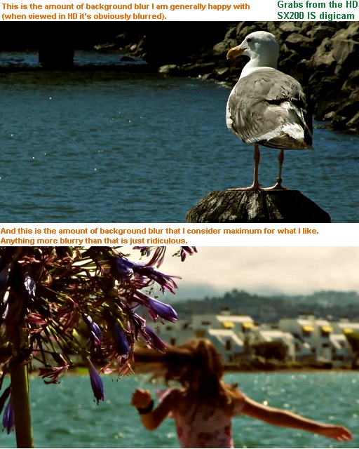
And of course, there’s the story itself, which is the most important element in a short movie. The reason I didn’t include it in the list above though is because not all videographers shoot short movies. Some just shoot abstract art, or nature and travel pieces, so it’s not always a part of the film *look* quest.

Finally, here are some nice tutorials about some of the points above.