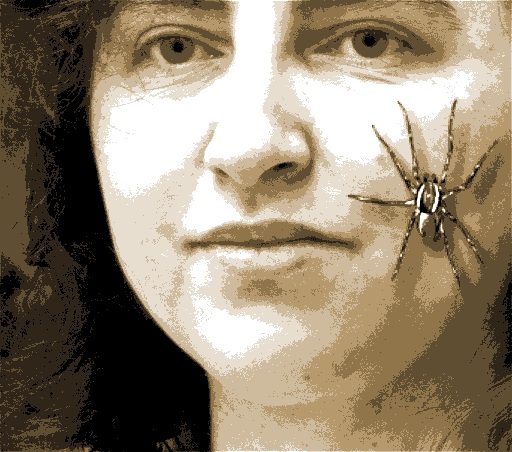
About Eugenia Loli

– I was born in Athens, Greece, but I was raised all around the prefecture of Preveza. My favorite place on Earth is the small mountainous village I originate from, called Skiadas (you can see my dad, his dogs and his home in the linked video). I’m currently living in Washington State, after 20 years in California.
– I studied “Programming and system analysis”. I have experience with databases, Artificial Intelligence, user interfaces.
– I re-launched OSNews.com in 2001 as its editor-in-chief (scoring an average of ~250,000 daily pageviews by 2005). I also wrote & ran GnomeFiles, a GTK+ software repository back on that time. I also wrote for various printed technology magazines.
– I later switched to more artsy stuff, working as a videographer/filmmaker (music video director/editor). Then I became a rather successful and published collage artist, and most recently, an illustrator.
– I’m a Paleo dieter since 2011, with emphasis on low carb veggies and fish, to cope with my celiac disease. Favorite food is whole lamb on a spit. Or rotisserie intestines (called “kokoretsi” in Greek).
– I enjoy science fiction and interesting experimental music. My favorite movie is The Matrix. Favorite musician probably is John Maus. As a hobby, I like to research psychedelic trip reports and cross reference them with spiritual visions and alien/ufo reports (hint!).
– I love cooking, helping others, walking, and having deep conversations with smart people. I dislike idiots who deny climate change.

This blog is not meant to give medical advice or to make any health claims on the prevention or curing of diseases. This site is only for informational and educational purposes, and for my own need of ranting.
I buy by myself the vast majority of the gadgets/products I write about. Rarely, I might receive a free review copy of some software, or some free gadget. All the opinions & findings expressed in my blog posts & comments are my own, they are honest, and are not endorsements or advertising for these product vendors. If anything, I’m known to give products a run for their money. Any product links are for informational reasons only. No material connection exists between myself and these product vendors apart that (rare) free review copy. Additionally, this blog never featured any kind of advertising (reviewed product-related, or just generic bulk advertising). This blog is ad-free, at all levels.


