Author Archive

A good show and a bad show

We watched the premieres of the “Reaper” tonight at CW and “Big Shots” on ABC. Here you get a cheap show like the “Reaper”, shot in Vancouver no less, and it’s very funny, interesting and well directed (by Kevin Smith). And then you get the expensive “Big Shots”, which is dull and stupid. Why anyone would want to watch a series where all 4 main characters are man whores and they are all CEOs but we learn nothing about what they exactly do at their jobs. Zero morals on that show, it made me wanna puke. I hope it gets canceled for the sake of our civilization.

Same goes for “Cane” too. That show was not nearly as bad as “Big Shots”, but again, why would I want to watch some rich people killing anyone on their path to get richer? I am much better represented by Dr Who and his teleporting phone-booth rather than “Cane”.

Some more color grading

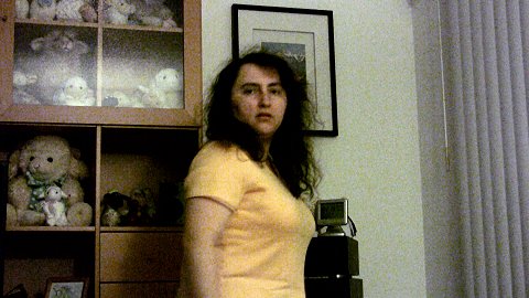
It seems that what I enjoy most in the whole videography thing, is color grading. I enjoy that even more than shooting, or editing. Shooting tires me, editing frustrates me (especially because I am good at finding bugs all over the place), and exporting bores me as it takes forever to encode. But color grading, well, that’s fun! Here’s some nice dramatic color grading. I used the footage I shot tonight, which has lots of noise because of the low light in the room, but I think the result shows my point.

As shot

After color grading

How it’s achieved (for these specific light conditions) under Vegas:

1. Plugin Magic Bullet Movie Looks HD: “Bleach Bypass” to 50%.
2. Brightness and Contrast plugin: Contrast at 0.10.
3. Color corrector plugin:
– Studio RGB to Computer RGB template.
– White balance the Mid and Highs.
4. Aav6cc freeware plugin: Jack up saturation to 60% for the most prominent color in the scene (in my case, my yellow t-shirt).

Update: Some more color correcting and grading. Original image by Wonderlane, licensed under the CC-BY-NC license. Used here for educational purposes.

As shot

After correcting & color grading

Plugins used: Magic Bullet Movie Looks HD (“Green Pearl at 50%”), Contrast (at 0.10), and Color Corrector (white balance color correction, saturation 1.200 and Gain at 1.100).

Special effects

My first ever special effects work. Sure, it ain’t very good (I only spent 10 mins on it), but it was fun.

Next up, be prepared to see me with a Jedi lightsaber. Hehehe…

Most popular blog posts

The six most read blog posts on my blog:

1. Canon HV20 24p Pulldown (by far the most popular post)
2. From DV/HDV/AVCHD to PS3/Xbox360/AppleTV
3. From DV/HDV/AVCHD to Flash Video
4. Achieving the CSI:Miami look
5. Color Grading Tutorial
6. Crash course on Sony Vegas

Wait, what? My “perfect society” post didn’t make it through? 😀

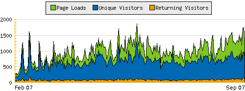
Obviously this “new video business” I introduced to my blog four months ago generates page views (not that I really care of course). These articles don’t create visitors that “stay” here, as they mostly come from search engines and video forums and they never return after they acquire the needed information.

As you can see on my stats, while pageviews are riding pretty high, I have no more than 100-150 loyal readers. So, thanks to whoever you are. It’s important for me, as my blog is my shrink.

Regarding the Apple PDA

According to AppleInsider, Apple is preparing an “iPod Touch”-like PDA. I must say that this doesn’t make any business sense. There is no reason to create a “PDA” in this day and age. That market is dead. The market wants convergence instead, one device that does lots. Now, if by “PDA” they mean a larger iPod Touch with a bigger screen, I’d buy the argument. But just “PDA”…?

In the meantime, Apple doesn’t want us to “hack” their devices. Well then, they better release a fucking official SDK. Customers hack these devices because they want something more out of them, and Apple does not fulfill this customer need. So, what’s up with that Apple? Maybe Adam’s suggestion to boycott them is what some should do.

Regarding the semi-pro cameras

You know. I am talking about these semi-pro cameras that cost between $2500 to $8500. Usually manufactured by Panasonic, Canon and Sony. These 24p cameras produce a very high quality HD image and are pretty adjustable/customizable to even make their footage look cinematic. And yet, cheap TV series still don’t use them. Only TV news and Indies are using them mostly.

We were watching “The Shield” with JBQ the other night and we were put off on how pedestrian the look was. The lighting was minimal (they had to overexpose in many scenes in order to make it look not too dark) and there was no color grading whatsoever apart from the basic white balance. Obviously, a “cheap” TV series. And yet, when we read its tech specs on IMDb, they used an Arri camera. You know, these ones that usually cost between $60,000 to $120,000. And then they have to develop and scan the film too.

My question is: WHY? The look of that TV series could easily be captured with a semi-pro camera without even sweating on it. Why spend all that money when you can do the same job with cheaper tools?

“PINK” Webisode 04

Sorry for keep linking it guys, but you know, “Pink” is the *only* free serialized web TV series that’s actually professionally done. To me, it’s a little filmmaking gem on the web.

Upcoming reviews

I published the JVC camcorder review today while up and coming reviews include: an unlocked iPhone review (review will be focusing on the unlocking), a TyTN-II, a tripod dolly by Tiffen, and a 1080p upscaling DVD/DivX player.

Drist – “Surfacing”

I thought I fooled you all,
here in this shallow surfacing
A ring around it all, showing you
This is all I know

Thought you gave it all, right here
But I saw it go down
You became it all, wants and needs
And I saw it go

If you only could see

I can’t give you up, if only I could
I can’t lift you up, if only I should

Wait here, I’m coming

Lyrics from “Surfacing“, my favorite song from Drist’s first album, “Bitter Halo“.

Glaringly obvious usability omissions

SuSE actually has a usability dpt, and yet some obvious things are slipped through and never get fixed. Check this SuSE 10.3 screenshot and look at its “start” menu. The headers “Favorite applications and “Recent applications” are not bold and they have no soft background color behind them, making it extremely difficult for the eye and brain to figure out what is what quickly enough. The brain has to spend extra calories to work on that menu. That portion of the screen just looks a mashup of text rather than distinguishable items.

Same goes for the Gnome Control Center which I filed a bug report about it a year ago, and it hasn’t been fixed either. And we are talking about a 2 minute fix that would really help out usability. A fix that it’s so glaring obvious to me…

Update: Here’s my take on SuSE’s start menu. To me, this looks much easier to digest and sort out in my brain. Update 2: Mockup updated.